

Designing Utility: A User-Centered Approach to Interface Design
Learn user-centered UI/UX design principles, usability, accessibility, and best practices for creating useful digital experiences.

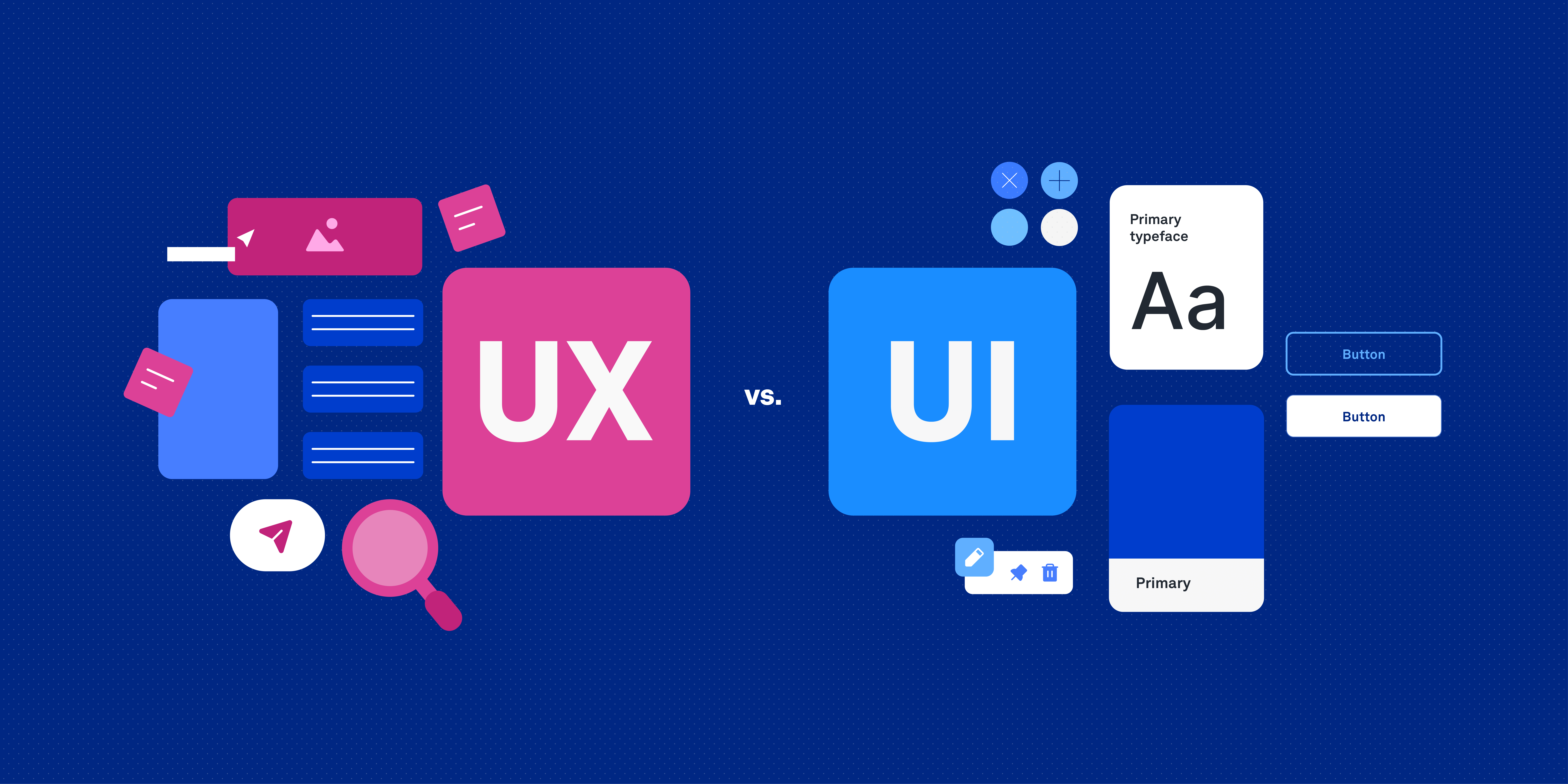
In today’s digital world, design is no longer just about creating beautiful screens. A successful product must solve real problems, guide users effortlessly, and provide meaningful experiences. This is where utility-driven UI/UX design becomes essential. Utility in design means creating interfaces that are useful, usable, accessible, and aligned with user needs.
For beginner UI/UX designers, understanding user-centered design is one of the most important foundations for building successful digital products. Whether you are designing a mobile app, website, dashboard, or software platform, your primary goal should always be to help users accomplish their tasks efficiently and comfortably.
This article explores the principles, methods, tools, and best practices behind designing utility-focused interfaces using a user-centered approach.
Understanding UI/UX Design
Before diving deeper into utility design, it is important to understand the difference between UI and UX design.
What is UI Design?
User Interface (UI) Design focuses on the visual and interactive elements users see and interact with. This includes:
Buttons
Colors
Typography
Layouts
Icons
Forms
Navigation systems
UI designers ensure the interface looks attractive, modern, and visually organized.
What is UX Design?
User Experience (UX) Design focuses on how users feel while interacting with a product. UX designers aim to create experiences that are:
Easy to use
Efficient
Accessible
Enjoyable
Problem-solving
UX design involves research, testing, wireframing, user journeys, and interaction planning.
What Does “Designing Utility” Mean?
Designing utility means creating products that genuinely help users achieve their goals without confusion or frustration.
A utility-focused interface answers questions like:
Can users complete tasks easily?
Is the information understandable?
Does the design reduce effort?
Is the interface accessible to everyone?
Does the product solve real problems?
A beautiful interface without usability is ineffective. Similarly, a functional product without good experience feels frustrating. Great design balances both utility and aesthetics.
The Importance of User-Centered Design
User-centered design (UCD) is a design philosophy where the user becomes the center of every decision.
Instead of designing based on assumptions, designers:
Research user behavior
Understand pain points
Test ideas with real users
Improve designs based on feedback
This process ensures the final product aligns with actual human needs.
Core Principles of User-Centered Interface Design
1. Understand Your Users
Every successful product starts with understanding its audience.
You must learn:
Who the users are
What problems they face
What devices they use
Their technical knowledge
Their goals and frustrations
Methods for User Research
User interviews
Surveys
Competitive analysis
Analytics
Observation
User personas
Example
A food delivery app for students should prioritize:
Fast ordering
Budget-friendly options
Mobile responsiveness
Easy payment systems
Meanwhile, a banking app requires:
Security
Clarity
Trust
Accessibility
Understanding context changes everything.
2. Prioritize Simplicity
One of the biggest mistakes beginners make is overdesigning interfaces.
Simple interfaces are:
Easier to understand
Faster to use
More accessible
Less mentally exhausting
How to Achieve Simplicity
Remove unnecessary elements
Use clear labels
Limit color usage
Keep layouts organized
Focus on primary actions
Good Simplicity Example
A login page only needs:
Email field
Password field
Login button
Forgot password option
Adding unnecessary graphics or animations can distract users.
3. Design for Accessibility
Accessibility ensures everyone can use your product, including people with disabilities.
Accessible design improves usability for all users.
Accessibility Best Practices
Use readable font sizes
Ensure color contrast
Add alt text to images
Support keyboard navigation
Use proper spacing
Avoid relying only on colors
Why Accessibility Matters
Millions of users worldwide experience:
Visual impairments
Hearing impairments
Motor disabilities
Cognitive challenges
Inclusive design expands your audience and improves overall experience.
4. Maintain Consistency
Consistency builds familiarity and trust.
Users should not relearn the interface on every page.
Consistency Includes
Button styles
Typography
Colors
Navigation patterns
Icons
Interaction behaviors
Example
If your primary button is blue on one page, it should remain blue across the product.
Consistency improves usability and reduces confusion.
5. Provide Clear Feedback
Users need confirmation that actions are working.
Feedback reduces uncertainty.
Examples of Feedback
Loading animations
Success messages
Error alerts
Hover states
Form validation messages
Example
When a user submits a form:
Show a success notification
Explain errors clearly if something fails
Never leave users guessing.
The Psychology Behind Interface Design
Understanding human psychology helps designers create better experiences.
Cognitive Load
Cognitive load refers to the mental effort required to use an interface.
Too much information overwhelms users.
Reduce Cognitive Load By
Grouping related content
Using whitespace
Keeping navigation simple
Breaking tasks into steps
Visual Hierarchy
Visual hierarchy guides users’ attention.
Designers use:
Size
Color
Contrast
Spacing
Typography
to highlight important elements.
Example
A “Buy Now” button should stand out more than secondary actions.
Hick’s Law
Hick’s Law states:
The more choices users have, the longer they take to decide.
Application
Avoid overwhelming users with too many options.
Simplify menus and reduce unnecessary decisions.
Fitts’s Law
Fitts’s Law explains that larger and closer elements are easier to click.
Design Implications
Make buttons large enough
Place important actions within easy reach
Improve mobile touch usability
The UI/UX Design Process
A structured workflow helps designers create better products.
1. Research Phase
The first step is understanding users and business goals.
Tasks Include
Market research
User interviews
Competitor analysis
Data collection
This phase identifies user problems.
2. Define Problems
After research, designers define:
User pain points
User goals
Product objectives
Example Problem Statement
“Users struggle to complete checkout because the payment process is too complicated.”
Clear problem definitions lead to focused solutions.
3. Wireframing
Wireframes are low-fidelity layouts showing structure and functionality.
They help designers:
Plan layouts
Organize information
Test user flows
Wireframes focus on usability rather than visuals.
4. Prototyping
Prototypes simulate real interactions.
Designers test:
Navigation
Animations
User flows
Interactions
Interactive prototypes help validate ideas before development.
5. Visual Design
This stage includes:
Typography
Colors
Branding
Components
UI systems
Visual design enhances usability and aesthetics.
6. User Testing
Testing reveals usability problems.
Common Testing Methods
Usability testing
A/B testing
Heatmaps
Feedback sessions
Designers observe real users interacting with the product.
7. Iteration
Great design is iterative.
Based on feedback, designers:
Improve usability
Fix confusion
Refine layouts
Optimize flows
Continuous improvement creates stronger experiences.
Essential UI/UX Design Principles
Clarity
Interfaces should communicate clearly.
Avoid:
Confusing labels
Complex layouts
Technical jargon
Users should instantly understand what to do.
Efficiency
Help users complete tasks quickly.
Examples include:
Autofill forms
Smart defaults
Search functionality
Short navigation paths
Efficiency improves satisfaction.
Flexibility
Different users have different needs.
Allow:
Multiple navigation methods
Personalization
Responsive layouts
Flexible systems adapt to users.
Error Prevention
Prevent mistakes before they happen.
Examples
Confirmation dialogs
Input validation
Disabled invalid actions
Reducing errors improves trust.
Mobile-First and Responsive Design
Modern users primarily access products through mobile devices.
Designers must prioritize:
Responsive layouts
Touch-friendly interactions
Fast loading
Mobile usability
Mobile Design Tips
Use larger touch targets
Minimize typing
Keep navigation simple
Optimize performance
Mobile-first thinking improves accessibility and usability.
Importance of Design Systems
A design system is a collection of reusable components and guidelines.
Benefits
Faster design workflow
Better consistency
Easier collaboration
Scalable interfaces
Common Components
Buttons
Inputs
Typography
Color palettes
Cards
Modals
Design systems are essential for modern digital products.
Popular Tools for UI/UX Designers
1. Figma
Figma is one of the most popular tools for interface design and prototyping.
Features
Cloud collaboration
Components
Auto layout
Prototyping
Design systems
It is beginner-friendly and widely used in the industry.
2. Adobe XD
Adobe XD helps designers create wireframes and interactive prototypes.
3. Sketch
Sketch is a popular UI design tool especially among macOS users.
4. InVision
InVision supports prototyping and team collaboration.
5. Photoshop
Adobe Photoshop is useful for image editing and visual asset creation.
Common Mistakes Beginner Designers Make
Designing for Yourself
Designers often assume users think the same way they do.
Always validate ideas with user testing.
Ignoring Accessibility
Accessibility should never be optional.
Inclusive design improves products for everyone.
Overusing Animations
Animations should support usability, not distract users.
Keep interactions meaningful and smooth.
Copying Trends Blindly
Design trends change quickly.
Focus on usability over aesthetics.
Skipping Research
Without research, design decisions become assumptions.
Research creates informed solutions.
How to Build a Strong UI/UX Portfolio
A portfolio is one of the most important assets for a designer.
Include Case Studies
Show:
Problem identification
Research process
Wireframes
Design decisions
Final UI
User testing
Employers value process more than visuals alone.
Focus on Real Problems
Design projects solving real-world issues feel more meaningful.
Examples:
Healthcare apps
Educational platforms
Productivity tools
Finance dashboards
Explain Your Thinking
Good portfolios explain:
Why decisions were made
What challenges existed
How problems were solved
Storytelling strengthens presentations.
Future of Utility-Driven UI/UX Design
The future of UI/UX design is becoming more intelligent, accessible, and personalized.
Emerging technologies include:
Artificial Intelligence
Voice Interfaces
Augmented Reality
Virtual Reality
Gesture-Based Interfaces
Despite technological evolution, one thing remains constant:
Design must always serve human needs.
The best interfaces are not necessarily the most visually impressive. They are the ones users can understand, trust, and use effortlessly.
Final Thoughts
Designing utility is about empathy, clarity, and problem-solving. A user-centered approach helps designers create products that are not only visually appealing but genuinely useful.
For beginner UI/UX designers, mastering user-centered thinking is more valuable than following trends. By understanding users, simplifying experiences, improving accessibility, and continuously testing ideas, designers can create meaningful digital products that make a real impact.
Great interface design is invisible. When users accomplish tasks smoothly without confusion, frustration, or unnecessary effort, the design has succeeded.
The journey of becoming a successful UI/UX designer takes time, practice, research, and curiosity. Continue learning, observing users, improving your process, and refining your craft. Every great designer starts as a beginner, but user-centered thinking transforms beginners into professionals.


